Graphic Style
Devlog Update: Context Menus, Tooltips, Crafting, and More!
Hello everyone!
I’m excited to share the latest progress on my survival game. This week, I’ve made several key updates and improvements. Here’s a detailed look at what’s new:
Context Menu Addition The first major change this week is the addition of the context menu. This small menu with various options appears when you right-click on an item in your inventory. The options displayed depend on the item type, thanks to polymorphism, which adds more depth to each item. The base object, called "ItemModel," has an action called "Inspect." It knows how to display this option in the context menu. For example, if the item can store other items, it will show the "Inspect" option normally; otherwise, it will show the option as locked. Since this is the base object, all items inheriting from it will have at least this option enabled in their context menus.
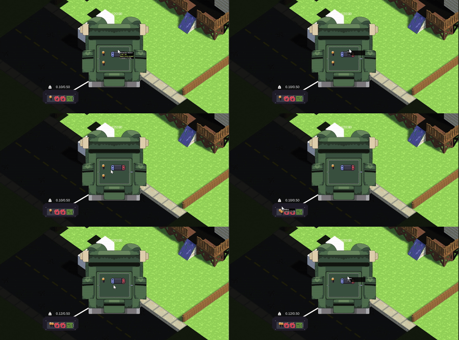
Enhanced Tooltips The tooltip system also takes advantage of this inheritance to display information. The information shown in the tooltip will be the cumulative text of the objects inherited by the current item, unless the latter decides to override how the information is displayed.
Honestly, I thought including the context menu and tooltips, along with multiple inventories on the screen, would cause visual overload, but that wasn’t the case. Normally, I would have used Unity's Canvas for both, but this time I opted for OnGui, which turned out to be a faster and easier choice.
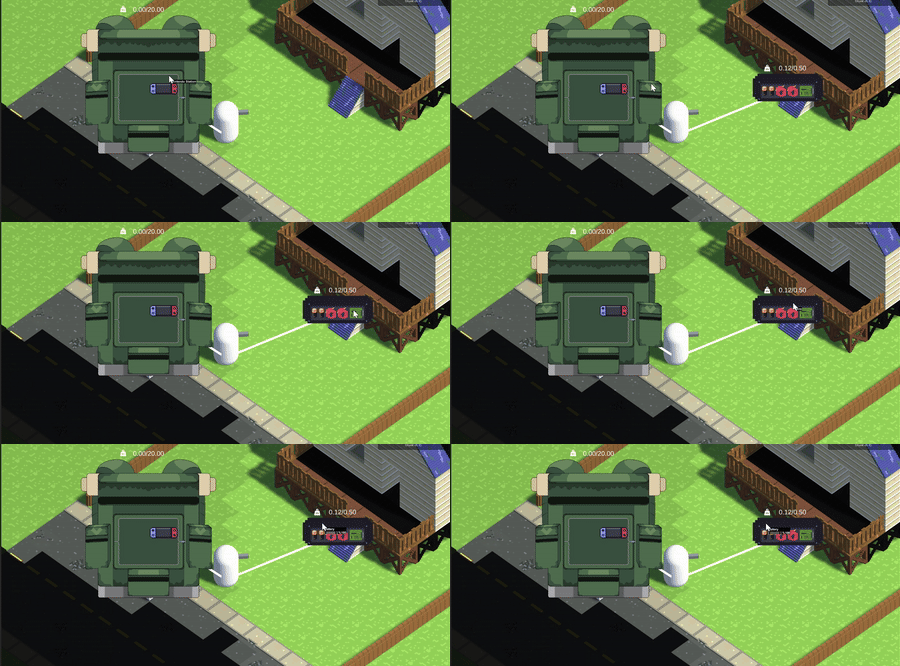
Metadata Management Let's talk about metadata. Objects have information found in their own records (ScriptableObject), such as how they should be painted, the object’s name, whether it has an inventory, category, etc. However, some will need dynamic information that can change over time, is unique per object, and can be stored in memory. To solve this, I decided to include an array of strings to store this information. Each object has a certain level of autonomy, managing and providing this information as needed.
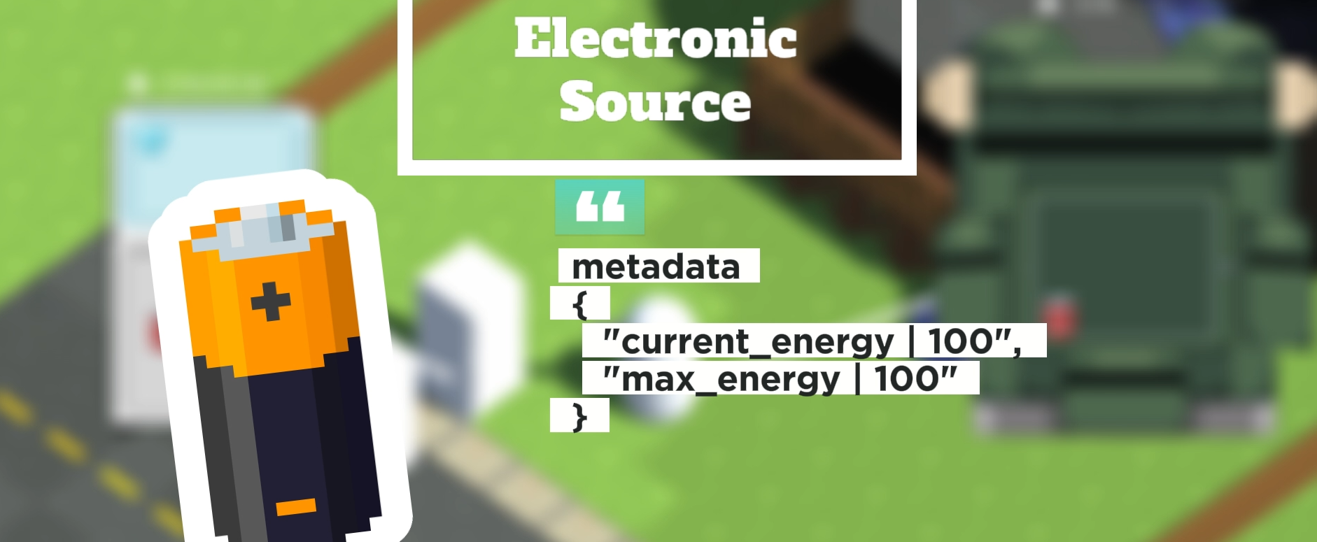
Drag and Drop Functionality Another quick change was the ability to drag an item directly to a physical inventory without having to open it first. This can be useful in situations where you just want to "throw" the item and not worry about organizing it at that moment. While programming certain mechanics, the process can become quite mechanical. It's during these moments that we can see which actions might be tiresome for players and program QoL (Quality of Life) solutions to improve their gaming experience.
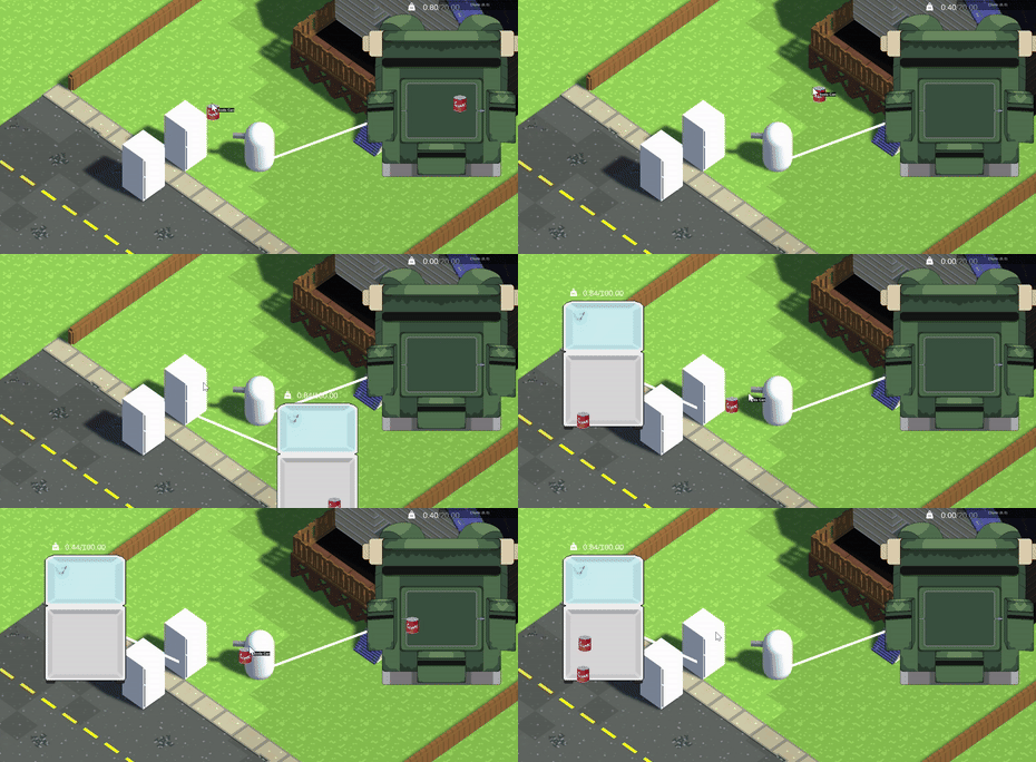
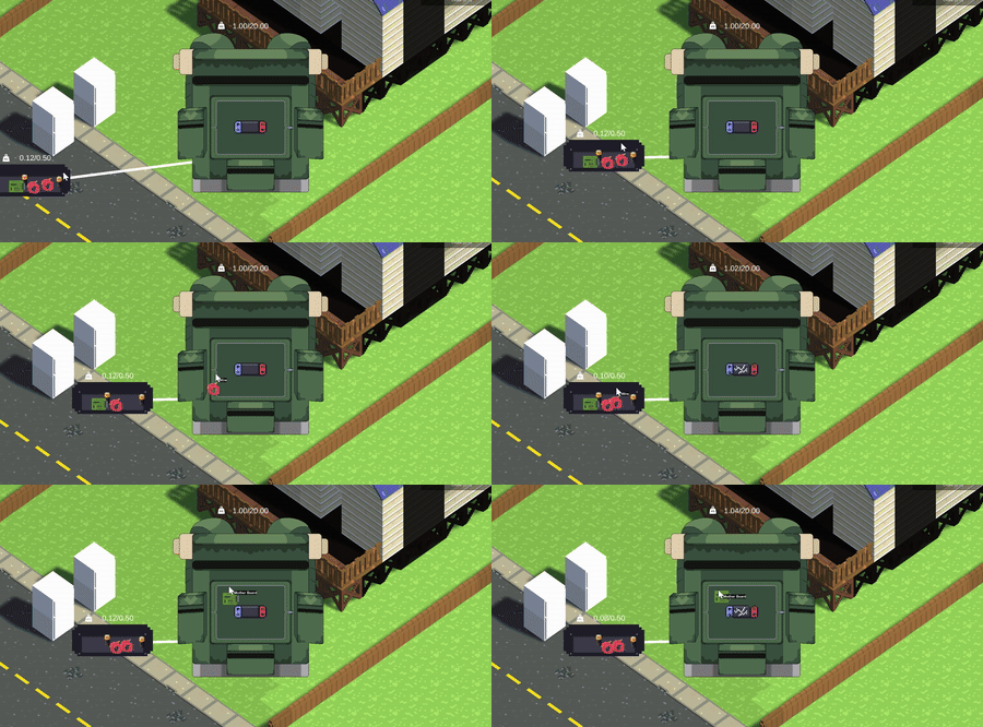
Crafting System Lastly, before wrapping up the inventory system, I want to talk about the crafting system. I plan to base much of this system on the existing inventory system. My idea is for some items to have "recipes" that activate if the item has specific objects in its inventory. This check is triggered when an object is added or removed from an inventory. The recipe content also has logical comparators for better control. For example, the "video console" item must contain in its inventory:
- 1 large chip (1 == large chip)
- 2 or more cables (2 >= cables)
Batteries are needed to power it, but not for it to be functional. If the recipe is not met, the result is a broken video console, and vice versa. This way, the inventory system can be used in new and exciting ways.
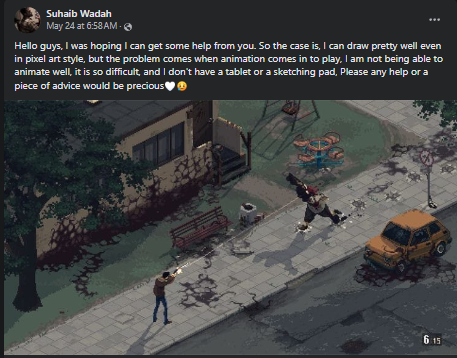
Graphical Improvements With the inventory system updates done for now, let's move on to graphical improvements to showcase the true visual style I have in mind for the game. A friend recently sent me a Facebook post featuring a pixel art scene. The style was magnificent, but it was the color palette and lighting that caught my attention, which I wanted to use as a reference.
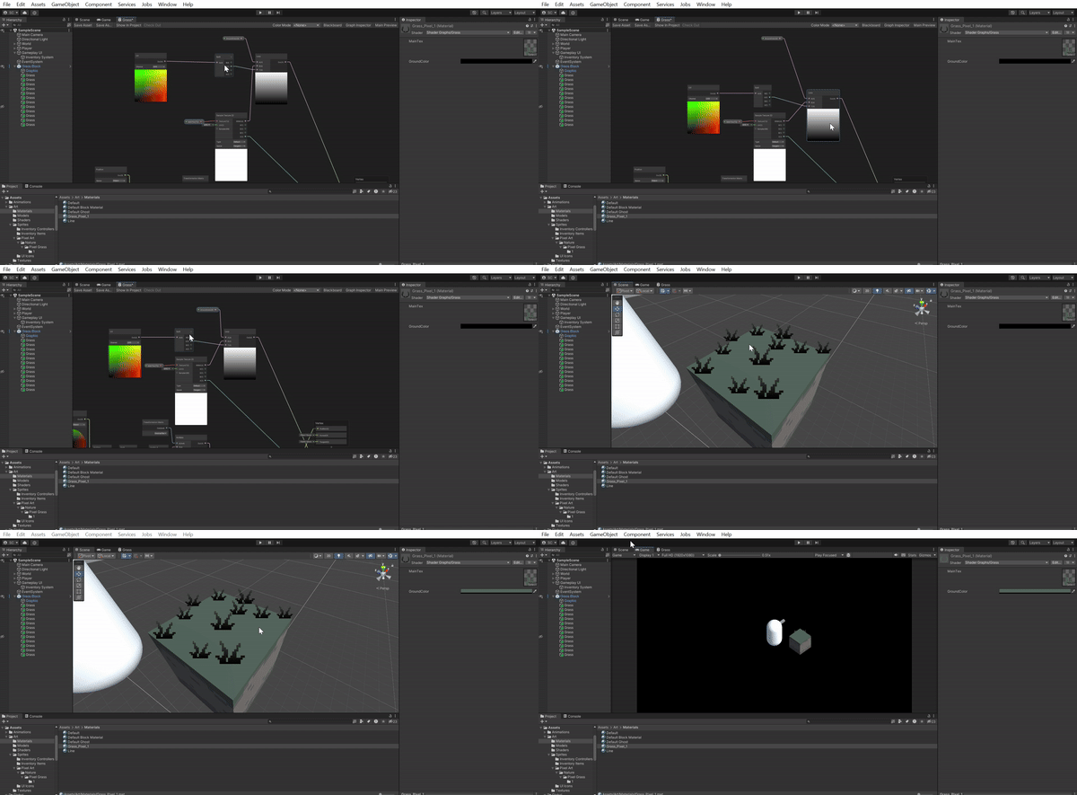
I adjusted the colors of the grass block to create a more muted and cold graphical style. Then, I added a few quads with pixel art grass images and applied a shader to make the grass color match the block better, blending at the top to stand out more. I also included the "Flipbook" node to add more frames to the grass, making it come to life.
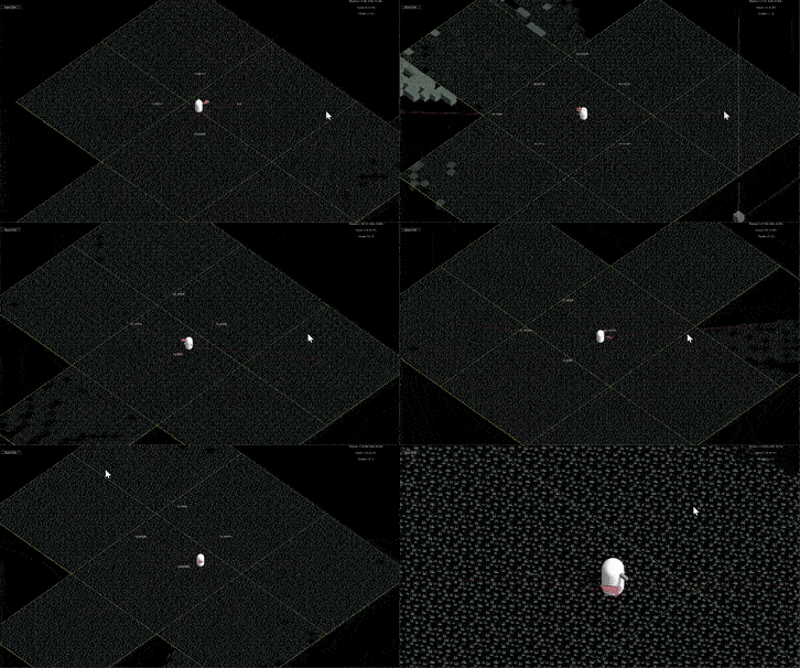
Performance Optimization When I hit play, I was thrilled to see everything looking more organic and lively. However, I quickly noticed a significant drop in FPS. I knew there were some fundamental errors in the tile generator, but I thought I had more time before seeing performance drops.
I knew structural changes were needed in the world manager, and though it would be time-consuming and difficult, I started rewriting and fixing many lines of code in a separate branch, just in case. One major change was finally adding a pooling system. Previously, the more parts of the map you discovered, the more objects were instantiated, causing FPS drops even when they were turned off.
The pooling system I implemented is based on usage. This means that in a game session, not all block types are used, so loading all of them from the start wouldn’t be efficient. Instead, each block type has a finite number of allowed instances. When a block type is requested from the pool, it checks the first object on its list. If inactive, it returns it. If active, it means more blocks are needed, so a new block is instantiated. If the limit is reached, it returns the last element on the list, even if it’s in use but off-screen. When a block is no longer used, it resets, turns off, and reinserts at the first index.
This system worked, but sometimes blocks would pop out in front of you, meaning more blocks were needed. With around 4000 instances already, another way to get blocks was to return those off-camera, i.e., when a chunk is far away, all its blocks disappear and return to the pool.
Another change was to the vision system. Now, chunks don’t load all tiles when the chunk loads; instead, only the chunk is marked as "inCameraVision." The vision system renders the tile, and the tile asks the chunk if it should render, saving more blocks. With all these changes, the world system became functional and optimized, with no FPS drops.
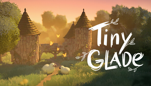
Art Style Shift After working with voxels, I decided it wasn’t the style I wanted. I’m now using low poly models textured with pixel art. However, I don’t like how low poly vegetation looks, as it appears inorganic, rigid, and boring. So, I researched techniques and styles that could work well together. “Tiny Glades,” a new game on YouTube, uses marching cubes to seamlessly connect everything and has impressive vegetation. I discovered a technique called "Normal Thief," where an object’s normals are transferred to another.
For instance, I’ll make a bush using Blender’s particle system and three quads. If I export and upload to Unity, it looks bad due to perpendicular normals, causing harsh color variations. The "Normal Thief" technique fixes this by transferring a sphere’s normals to the quads, making it look smoother in Unity.
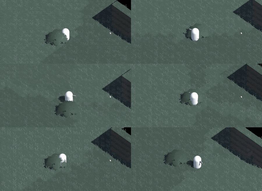
If I light the object without shadows, it looks fantastic but odd without shadows. With shadows on, it looks terrible. This issue is solved by duplicating global illumination and the bush. One light shines on the bush without shadows, while another light shines on a shadow-casting duplicate, excluded from the camera. Thus, the bush looks great and casts shadows.
The bush still looked rigid, so I modified its shader to include wind, which clashed visually with the frame-by-frame grass. I modified the wind shader to round displacement values, matching the frame-by-frame feel.
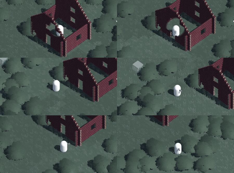
Log Wall Design Finally, I’m redesigning the walls to be log-style, fitting the nature and forest assets. In Blender, I made a low poly wall three logs high, randomly expanding vertices for irregularities, ensuring they share UV map positions to paint a single log texture. Trust the process, especially in art—it may look bad initially, but finish the process before giving up. Iterate as much as possible. I made three log textures, but only the third fit well in Unity.
These two weeks were packed with work and distractions due to the election week here in Mexico. But we’re back to normal now.
Next Steps The upcoming changes I’m working on are:
- Finishing the floor and ceiling
- Modeling some interior objects
- Replacing the player capsule with a human model and animations
Thank you for reading and for your interest in this project. If you leave a comment below, I’d greatly appreciate it. Comments help itch.io recommend this project more easily. Thank you all, and best of luck with your projects!
Files
Get Z-Engine
Z-Engine
| Status | Prototype |
| Authors | Argendel, [Random Adjective] |
| Genre | Survival, Simulation |
| Tags | building, Minecraft, Sandbox, Singleplayer, Top down shooter, Voxel, Zombies, zomboid |
More posts
- Personal InventoryMay 25, 2024
- Inventory SystemMay 17, 2024
- VerticalityMay 08, 2024
- XRayMay 06, 2024
- FOVMay 02, 2024
- Colliding WallsApr 30, 2024
- MiniaturizationApr 26, 2024
- First ProblemsApr 24, 2024
- World Edit ToolApr 11, 2024
Leave a comment
Log in with itch.io to leave a comment.